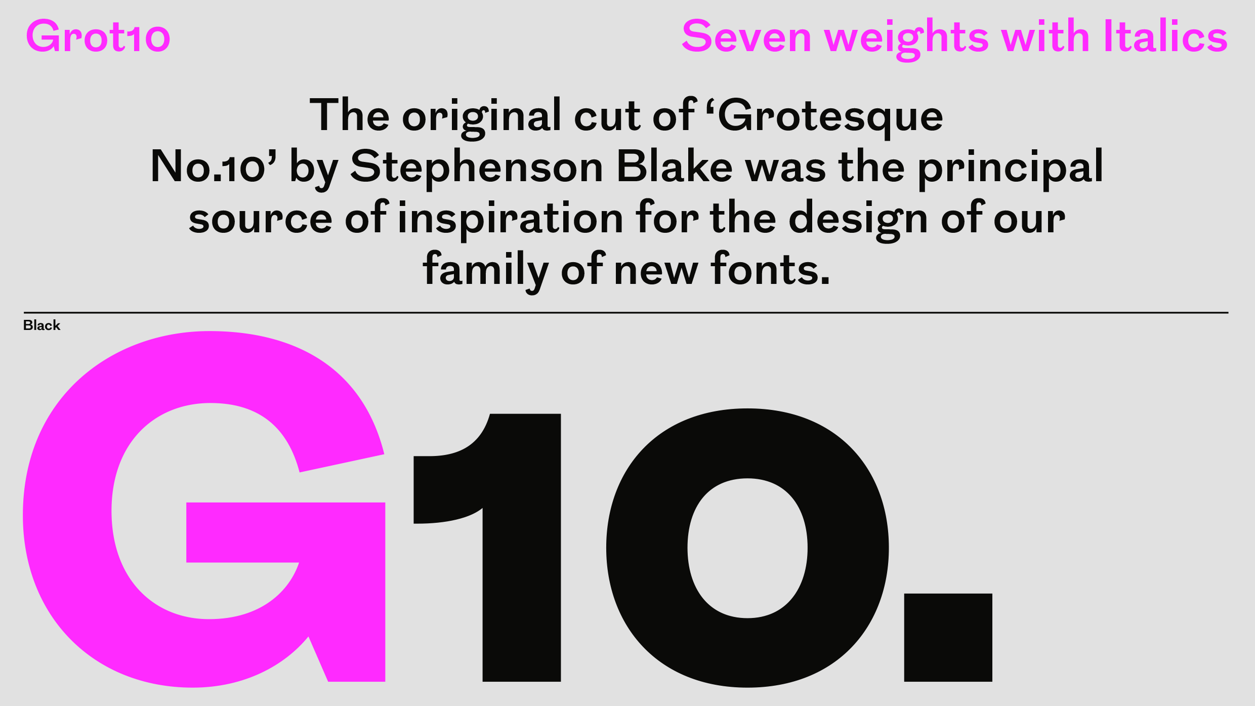
Grot10
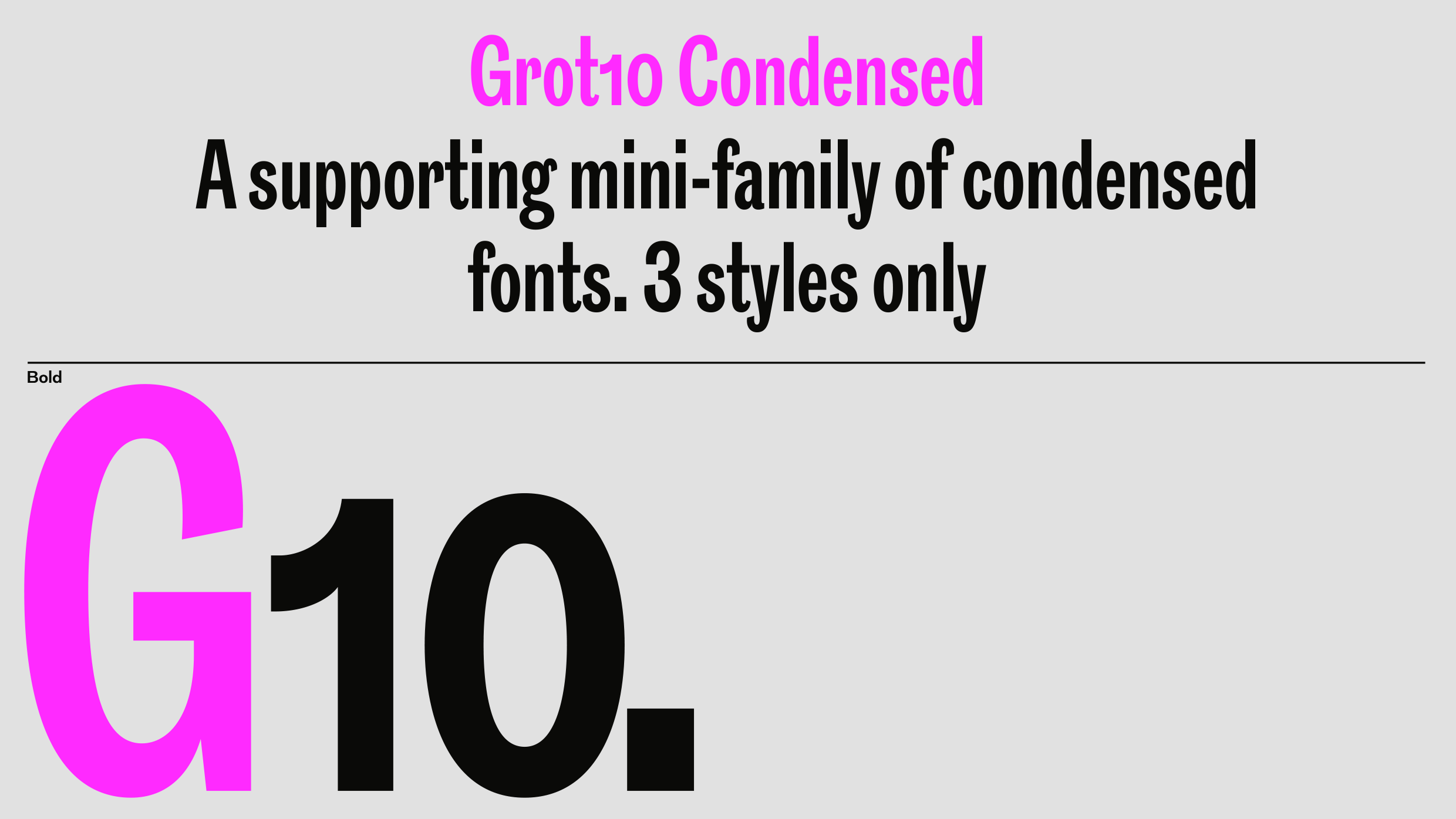
A contemporary take on the celebrated ‘Grotesque’ series of fonts created by the Stephenson Blake type foundry in Sheffield, England. The original cut of ‘Grotesque No.10’ by Stephenson Blake was the principal source of inspiration for the design of our family of new fonts. The Grot10 family has recently been expanded to include Semibold, Extrabold, and Black weights, and a mini family of Condensed cuts. The Condensed fonts were originally designed for The Royal Institute of British Architects Members Magazine, Riba J, in 2013.
ABCDEFGHIJKLMNOPQRSTUVWXYZ/abcdefghijklmnopqrstuvwxyz0123456789.,:
Please select a font license and the font(s) you would like to license before adding to cart
| Font name: | Grot10 |
|---|---|
| Font category: | Sans |
| Styles: | Light Light Italic Regular Italic Medium Medium Italic Semibold Semibold Italic Bold Bold Italic Extrabold Extrabold Italic Black Black Italic |
| Script: | Latin |
| Languages: | Afrikaans, Albanian, Asu, Basque, Bemba, Bena, Bosnian, Catalan, Cebuano, Chiga, Colognian, Cornish, Corsican, Croatian, Danish, Dutch, English, Esperanto, Estonian, Faroese, Filipino, Finnish, French, Friulian, Galician, Ganda, German, Gusii, Hungarian, Icelandic, Ido, Inari Sami, Indonesian, Interlingua, Irish, Italian, Javanese, Jju, Jola-Fonyi, Kabuverdianu, Kalenjin, Kinyarwanda, Kurdish, Latvian, Lithuanian, Lojban, Low German, Lower Sorbian, Luo, Luxembourgish, Luyia, Machame, Makhuwa-Meetto, Makonde, Malagasy, Malay, Maltese, Manx, Maori, Morisyen, North Ndebele, Northern Sami, Northern Sotho, Norwegian Bokmål, Norwegian Nynorsk, Nyanja, Nyankole, Occitan, Oromo, Polish, Portuguese, Romanian, Romansh, Rombo, Rundi, Rwa, Samburu, Sango, Sangu, Sardinian, Scottish Gaelic, Sena, Shambala, Shona, Slovenian, Soga, Somali, South Ndebele, Southern Sotho, Spanish, Swahili, Swati, Swedish, Swiss German, Taita, Taroko, Teso, Tsonga, Tswana, Turkish, Upper Sorbian, Vunjo, Walloon, Welsh, Western Frisian, Wolof, Xhosa, Zulu |
| Manufacturer: | A2-TYPE |
|---|---|
| Designer: | Henrik Kubel |
| Year: |
2010 |
| Copyright: | © A2-TYPE |
| Trademark: | Grot10 is a trademark of A2-TYPE |
| Licence: | Terms and conditions |
| Glyph count: | 551 |